|
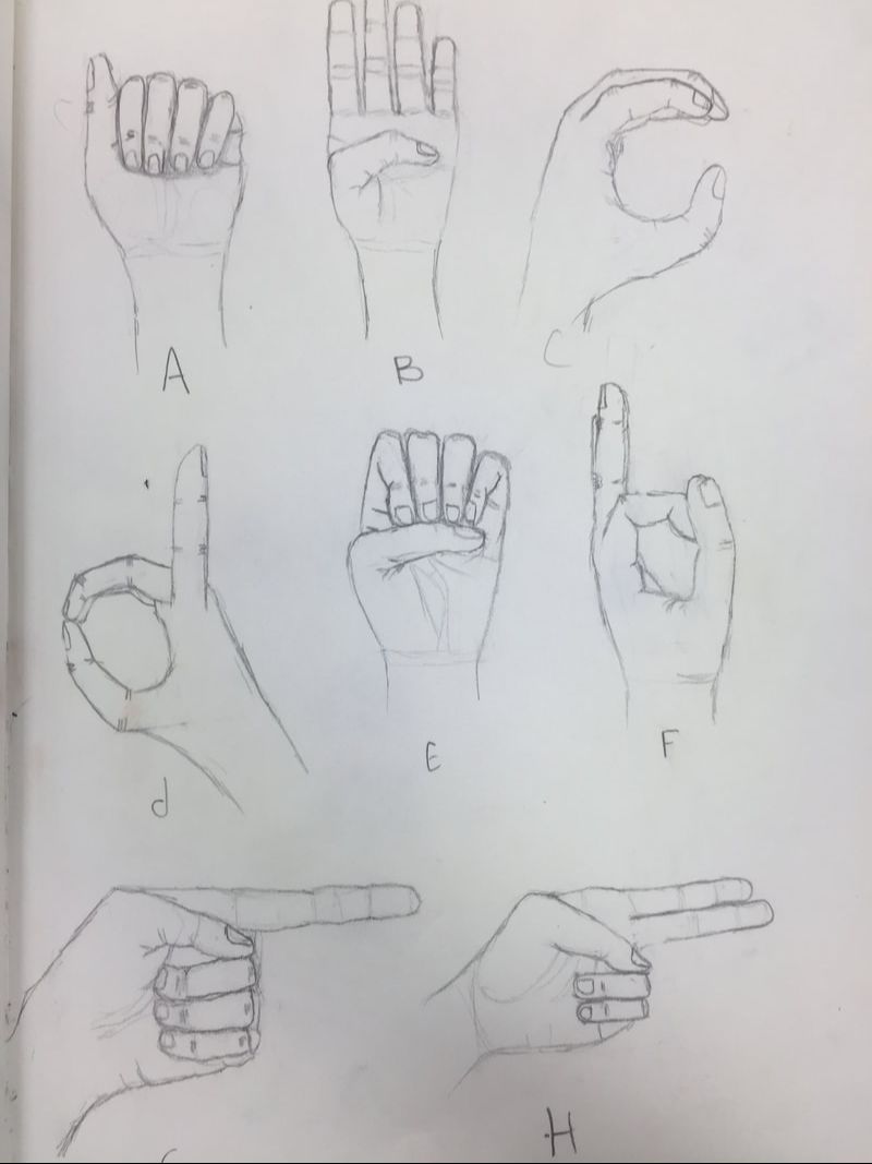
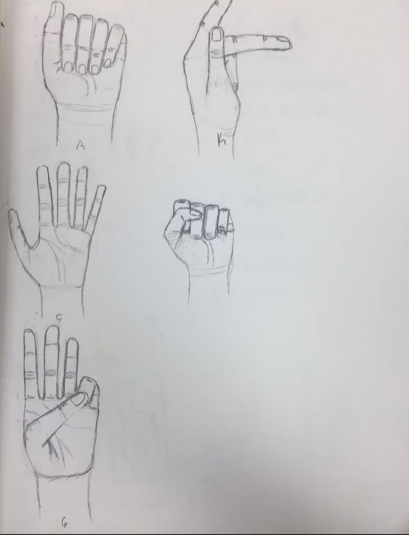
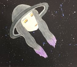
1. The steps to critiquing art are to: a) Describe the artwork by giving details about the piece as best you can, look at the colour schemes, pictures, images, etc. Think of it as if you had to describe the piece to a friend over the phone. b) Analyze the artwork by looking at the lines, shapes, colours, textures and space. Look for specific things in the piece. c) Interpret the artwork by looking for moods, or stories that might be told in the piece. Look for ideas that are represented. d) Judge the artwork, is it meaningful and successful? What are your personal opinions on the piece, do you like it? Would others like it? 2. The piece I made is a two-in-one piece that is made out of a human girl and Saturn. The girl's hair(other then the tips) and "hat" is in black and white while her face and tips of her hair are in colour. I used prisma coloured pencils to make layers to try and make it look as smooth as possible. The girl has her eyes closed and a content look on her face. she has orange and red eye shadow and lipstick to make the rest of it pop. The background is solid black with blue, white, and purple paint splatter to kinda make it look like a galaxy and stars. Saturn's ring acts as the brim of the hat, but isn't quite connected so it still looks like the ring around Saturn. There are some textures in the piece made by the prisma colours. Some parts look more smoothed out, like the ring around her head and her face, while other places, like the hair, you can see more of a bumpy texture that makes it look more like an unsmooth surface. She has a content look on her face, giving her a pleased look about being alone in the universe and relaxing. Since she has a content look on her face, I know she is content or pleased with something. She is alone in the piece, making it seem like shes enjoying the silence and solitude of being alone in space. I feel like this piece came out successful because it looks well done and like there was time put into it. I feel like I could have done better with the colours and that i should have stuck with having colour or it being black and white. I personally like it and how it is different then anything I've seen before and I feel like other people would enjoy this piece. 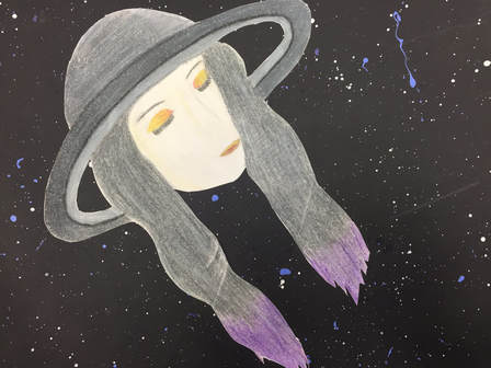 Sketchbook: pick any warm-up from your sketchbook that you found beneficial, interesting or simply felt you handled well. Describe the activity and reason for selecting it above the others. Include photo. One of the most beneficial warm up I've had is the sign language hand sketches. I've always had problems with drawing proportional hands and this helped me a ton. I practice a lot with this warm up on my own time too. All we had to do is make a letter in sign language and draw our hand on the paper. We started from basic shapes and blocks, to smoothing out the lines and adding details. I selected this above the others because drawing hands was a huge problem for me and now I can draw them very well. None of the other warm ups helped me this drastically.
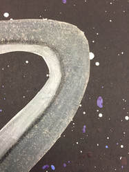
Medium: which medium did you most enjoy working with and why? Which medium did you not use but wish you had explored? Include photo.I most enjoyed using paint in this class, it was fun, and even a little challenging. I also enjoyed using it because it is tricky to get the right colour or shape on your canvas and I like a little bit of a challenge. I wish I had used oil pastels a bit more then I did. I mostly only used them for the sphere warm up and I feel like I should have used it a little more because its fun and easy, and even takes a little time to use which makes me feel like I'm more intrigued in whatever I'm using it for.
Pick two pieces that show how you have grown as an artist. Compare and contrast how you’ve grown, how the projects are related, and what you thought of each. The two pieces that i feel like show the most growth is my two-in-one(TIO) piece and my portrait piece. The first thing I notice I've grown in is the proportions of the face on each of my pieces. The shapes of the facial features are pretty good in my TIO piece, but i definitely feel like i should have made them bigger and closer to what a human face should look like. In my portrait piece, the facial features are much better, closer, and bigger then they were in my TIO and overall make the face look better. The projects are related by them both being based off a human. The TIO is just a human girl mixed with Saturn, making her look like shes wearing a hat, while my portrait piece is human because it's a portrait. I'm proud of both these pieces because the TIO was made before I got a lot of the skills that I used in my portrait piece, but it stilled turned out the way I wanted it to.
0 Comments
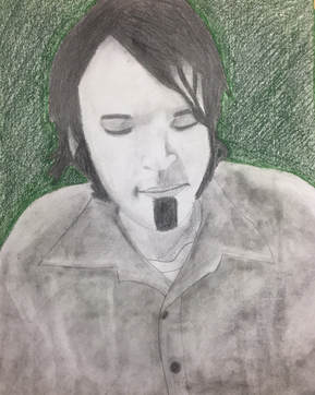
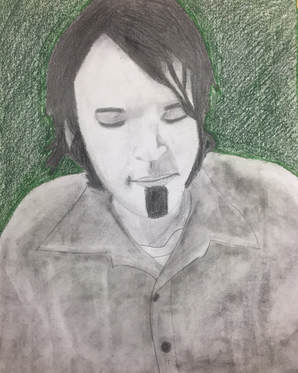
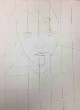
1. I made my portrait of my uncle Devlin. 2. I used pencils and some charcoal for my piece to make a black and white portrait with a coloured background. 3. First I found the picture that i wanted to use and made it b&w. I then printed it out and made a grid on top to help guide me. I then cut out a larger paper and made a proportioned grid on that as well. I first sketched the outlines of his features, including his hair, face, eyes, nose, mouth, etc. I then drew out his clothes then erased most of the guidelines and started to shade first with his hair. I made it very dark with lots of layers and blending. I then shaded his face and made the features more defined. I then used charcoal and a paintbrush to make a smooth fabric look for his shirt. After that I decided to make the background colour and used a dark green to contrast the b&w but not take away from it. I blended it closer to his body then made it less smooth around the edges to make a faded effect. 4. I think the whole thing turned out very successful, though I might have made the features more defined and like his, the eyes were a bit lighter and the eyebrows weren't as thick as they should have been. I also think i could have done better with the shading and lighting of the shirt.
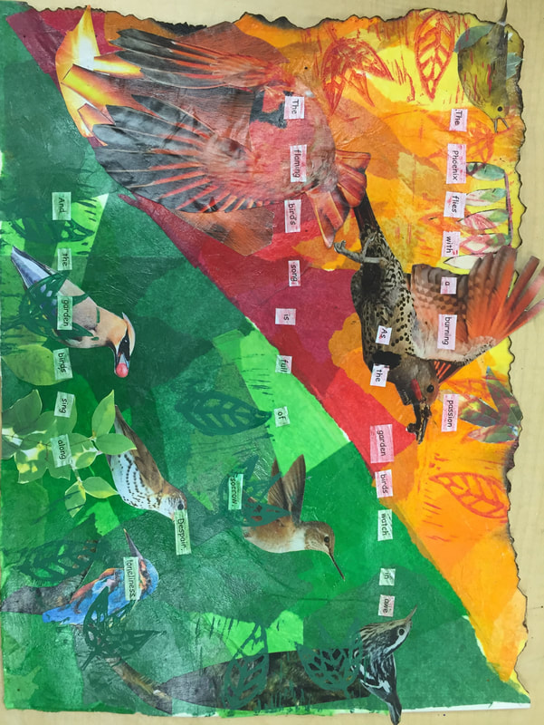
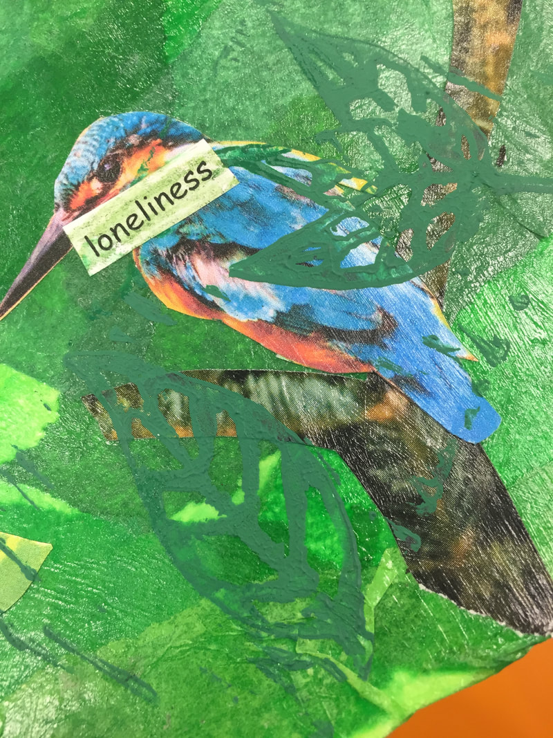
1. I used quite a few layers, the first being red, orange, and yellow tissue on one side and different greens on the other, making the slip diagonally across the page, then I burned the edges on the "fire" half of the paper. The next layer I used was prints of birds from magazines and off of printer paper, some red and "fire" colours and the other more natural colours. I also used stamps made of a linocut block to make leaf designs on top of some of the birds and had some leaf and tree cutouts. I had paper cutouts of words that created a poem and used coloured pencils, red on the "fire" side and green on the "natural" on top of that to blend it in to the rest of the piece. 2. My words were "fire" and "garden" and I use birds and lots of colours to show it. I used phoenix-like and red birds for the fire half and more natural colours like blue and grey for the garden side. I used fresh green leaf cutouts and stamps on the garden side while I used burned/scored leaf cutouts on the fire side along with red/orange stamps.
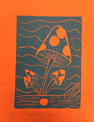
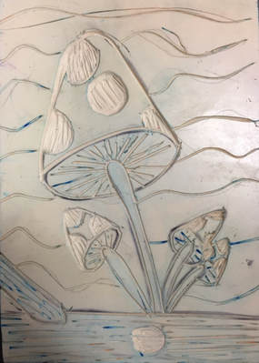
1. My print portrays the theme of line by the amount of lines were used. I made some lines in the background, lines on the log and mushroom bottoms. It has lots of different sizes and shapes of the lines as well to create more contrast so they didn't look too much alike. 2. My piece was successful because the image of the print turned out how I wanted it to. If I were to do it again i would try to get more clean lines in some parts including in the background. 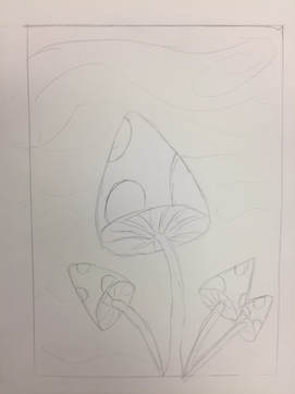
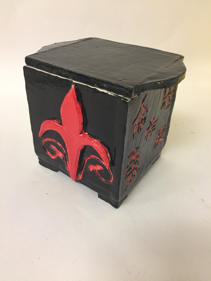
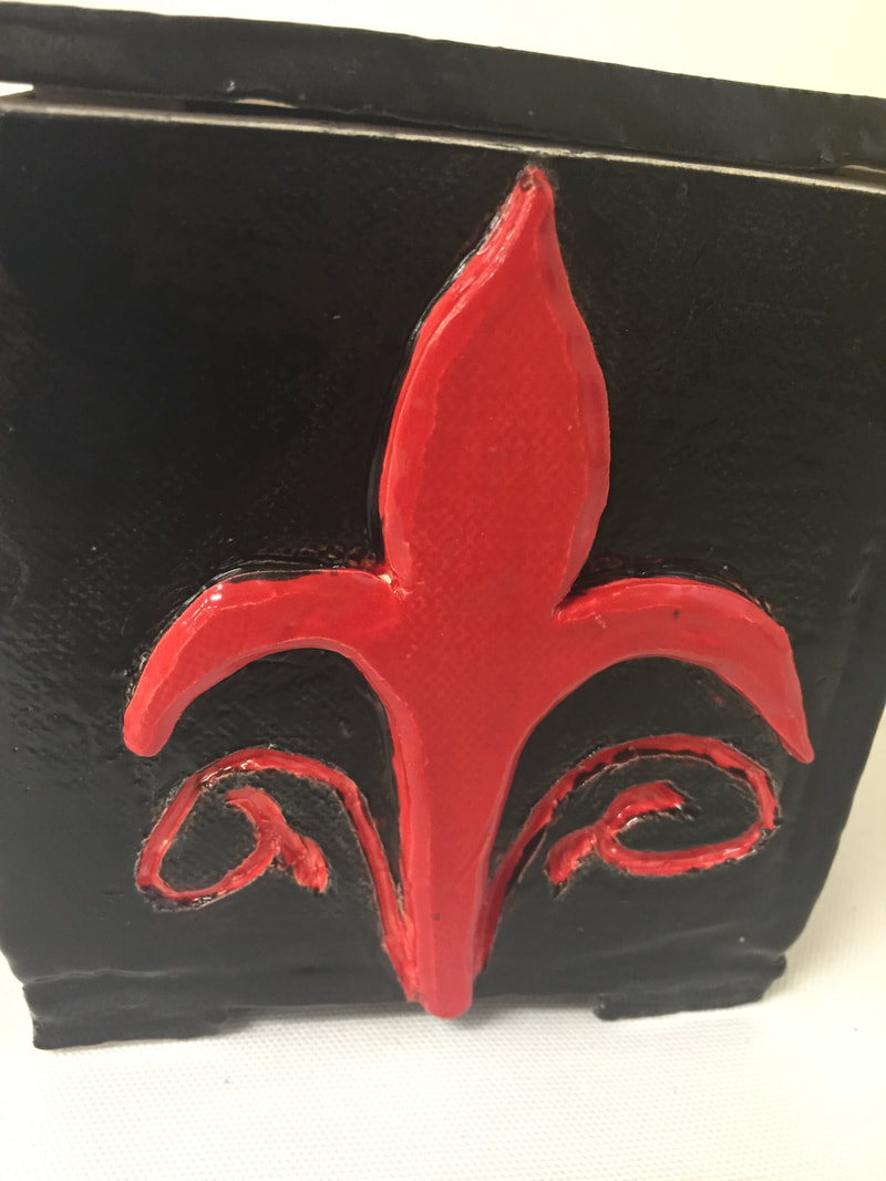
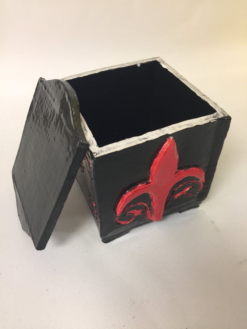
1. Since my last post, I glazed my piece mostly how I planned with the red designs and black interior/exterior. I made sure there were many layers so that none of the colours came out blotchy. I fired it again so the glaze would set and become glossy. I decided to keep the lid how it was in plain black. 2. One of the most successful thing about my piece is how the lid and sides fit together as well as the sides are straight and smooth with no fingermarks. 3. I would have tried to get the japanese characters more even and smoother looking then how they turned out. I also would have tried to make the areas where the sides come together look a bit smoother and less rushed looking.
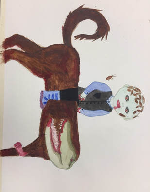
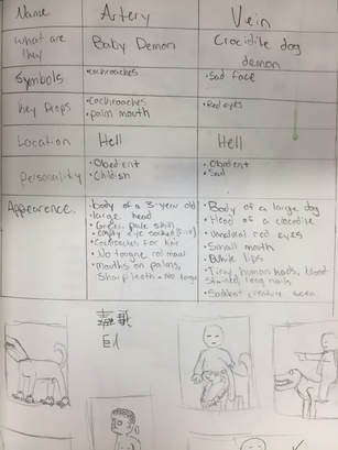
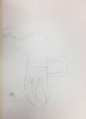
1. I plan to make the inside and outside (including the top) black, and making the characters and designs red. I might also add some more designs with the glaze around and on the design that is already on it. I also plan to possibly make more design on the top of the lid. 2. The only thing so far that I've found difficult to do was make the japanese characters in the sides of the box. They are small and precise and it's a little hard to get them clean and make them look nice and readable. 3. I really like how the lid of my box came out and how neat and straight the sides were. They also didn't bend or have any finger marks. 4. First I flattened a large slab of clay to make the sides, bottom, and lid out of. I cut them out and set them out to become leatherhard. Once they were sturdy enough to hold, but soft enough to stuck together, I used score and slip to first put together the side of my box. I then used it to attach the bottom. To make the lid lock I put small squares of clay in the corners of where the lid meets the sides of the box. I also made small handles on two sides of the lid to lift it up and attached them with the score and slip technique. I then cut out the designs for two of the sides and attached those with score-slip as well, I then carved out the japanese characters on the other two sides. I then waited for my box to dry to be fired. 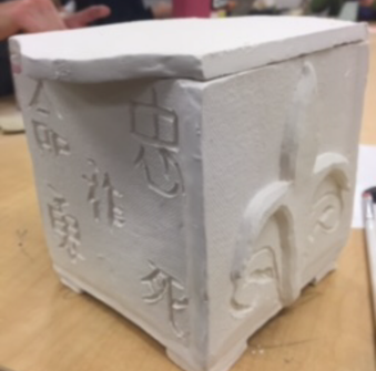 1. I created Vein, a dog-crocidile-human, and Artery, a green-cockroach infested baby, from the book Demonata by Darren Shan. 2. My design is different because everyone imagines things differently. I also has Artery riding Vein, which never happened in the book. I had the colours how I personally imagined them and their sizes as well. 3. I first started off with drawing my characters lightly in pencil, then started making my colours that I was going to use in my watercolour palette. I started with the lighter colours including the face of Artery, the head of Vein, and the lighter clothing. I then went on to the fur and darker clothing along with the red that represented blood. Advice that I would give to someone using watercolour is to make sure you use your lightest colours first. Always use layers for darker types of the same material(such as if you're painting fabric).
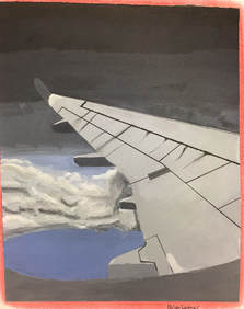
My place is in an airplane 38,000 miles up from the ground. It is important because I took my picture on the way to my mom's house in Pennsylvania. I don't get to go there often so it's special to be able to take this kind of photo. The most challenging part was getting the colours for the sky right and getting the texture of the clouds. I feel most successful part of my piece is the shape and details of the wing. I feel like i got the colour pretty close to the actual colour with makes me feel better about my piece as a whole. My ProcessThe most helpful warm up for this project i feel is the value scale. It helped me practice on tinting and shading my colours to get the colours I need.
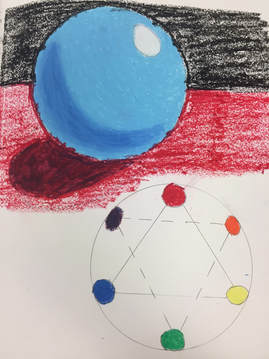
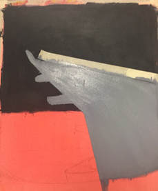
I used coloured pencils for my project because I have always likes using colours pencils since I was a little kid. To be able to learn how to use them better and that there are different kinds I can use as well as techniques. I mixed together a girl and saturn for my project, making the top and ting of the planet into a "hat" while her face was the southern hemisphere. My Process
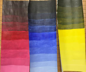
Tested ColoursAs a table group, we tested three different colours using paint chips, green, purple, and orange. I learned that it is harder to lighten colours that are dark, and also that its more difficult to match colours. I also found out that some colours, like green, are much harder to make then say purple. 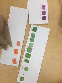 Brown SwatchesBrown is quite easy to make. All you do is take two colours that are opposite on the colour wheel, or complimentary colours, and combine them. Some common mixtures are Purple and yellow, Blue and orange, as well as red and green. Each combination makes a different type of brown. 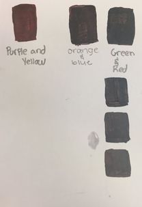 |
Archives
January 2018
Categories |

 RSS Feed
